Banner
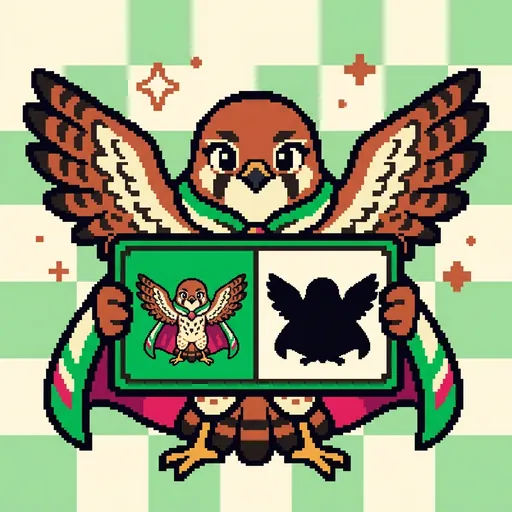
SILHOUETTE — *the impact pose. recognizable from outline alone. good character art reads at thumbnail.*
Listen along — Banner
Loading audio…
Press play to listen along. The line being read lights up as you go.
Show full transcript
Loading transcript…
Chapter 5 — Banner and the Outline That Tells the Story
Banner was a kestrel-tween, small and quick, with feathers the color of warm russet earth. Her wingtips were a bold, dark brown, and when she spread her wings, they formed a dramatic, almost cartoonish silhouette. She always wore a small herald-cape, the fabric stiff enough to hold its shape. Tucked into one pocket was her most prized possession: a small, sturdy test-card. On one side, it showed a full-color character sprite. On the other, the exact same character appeared as a solid black shape, a pure silhouette. Both versions had to be instantly recognizable.
Banner was deeply patient, especially about what she called “silhouette-discipline.” She often said, “Recognizable from outline alone. If it works as silhouette, it works as art.” That test-card was her signature. If the black outline on the card didn’t clearly show the character, Banner believed the design needed more work. No amount of fancy details could fix a weak shape.
Her work centered on the idea of the silhouette. This was a design principle: great character art should be readable even at thumbnail size, just from its outline. Many new artists made the mistake of adding tiny details first, before they had a strong basic shape. Banner insisted that was backwards. A strong silhouette meant a strong character. If the outline looked generic, no amount of intricate coloring or shading would save it. But if the outline was distinctive, even simple colors made the character pop. This was especially true for pixel art. At tiny sprite sizes, like 16x16 or 32x32 pixels, there simply wasn’t room for fine details. The silhouette was the character. Banner made this “silhouette-first” approach clear to everyone, celebrating instant-readability as a high form of craft.
“The impact pose,” Banner would say, her voice quiet but firm. “Recognizable from outline alone. If your character’s silhouette can’t be told apart from another character’s silhouette at thumbnail size, the design needs work.”
She taught her students how to build strong silhouettes, step by careful step.
First, the silhouette test. “Black-fill your character,” she’d instruct. “Just look at the outline. Is it recognizable? Does it stand out? Is it strong?” She’d hold up her test-card, pointing to the black shape. “This hero, Sir Reginald. See how his sword is raised, his shield forward? You know who he is, even without color.”
Next came the iconic-pose strategy. “Design your character in a pose that makes its silhouette unmistakable,” Banner explained. “A hero with a sword raised high. A villain with arms crossed, leaning back. A wise sage with a staff extended. The pose itself tells you about the character.” She would demonstrate, striking a pose herself, her small kestrel wings spread wide, then holding still. “My own outline,” she’d say. “It tells you I’m ready to take flight.”
Then, distinctive-feature emphasis. “Does your character have a tall hat? Spiky hair? An unusual weapon? Large ears?” Banner would ask. “These features define the outline. Lean into them. Exaggerate them a little, if it helps the silhouette.” She showed examples of characters with flowing capes or unique headgear, explaining how these elements made the outlines unique.
After that, thumbnail readability. “Test your sprite at thumbnail size,” she’d urge. “Can you still tell who it is? That’s the threshold.” She would shrink a character design on the screen until it was no bigger than a fingernail. If the character became a blur, it failed the test.
For pixel artists, Banner stressed the pixel-art-extreme application. “At 16x16 pixel resolution, every single pixel matters for the silhouette,” she’d say, tapping a tiny grid on her screen. “Internal details are a luxury you might not have. The silhouette is a necessity.” She showed how moving just one pixel could drastically change the character’s recognizable shape.
She also connected her work to other creative fields. “The silhouette principle applies broadly,” Banner noted. “A character should be recognizable in any medium, with minimal information. Think of a dancer on a stage, or a character described in a book. You should get a sense of them, a feeling, from just their basic shape or description.” She called this cross-app design-language continuity.
Finally, Banner warned against anti-detail-overload. “More detail does not equal better design,” she said, shaking her head gently. “A strong silhouette with minimal detail often beats a weak silhouette with lots of detail. Less can be more.”
Banner grew up in the high-tower village, nestled among the clouds. Her family had served as banner-bearers for the village pageants for generations. They were kestrels whose distinctive wing-spread silhouettes had become the village’s heraldic emblems. Over many generations, they learned a simple truth: “The silhouette is the herald. If the silhouette is strong, the herald is strong.” Banner carried that lesson deep in her bones.
When she was thirteen, Banner walked the winding paths to PixelForge, a place of learning and creation. There, she met Palette, a wise mentor. Palette looked at the young kestrel, her eyes sharp and knowing. “What is the silhouette?” Palette asked.
Banner didn’t hesitate. “The impact pose. Recognizable from outline alone. Good character art reads at thumbnail size.”
Palette smiled. “You are appointed,” she said.
In her workshop, Banner often demonstrated with her trusty silhouette-test-card. A small group of students, their eyes wide, watched her intently. “Watch,” she said, holding up the card. On one side, a valiant knight, Sir Reginald, stood in full color, sword raised, shield ready. “Here’s our hero with sword and shield,” she explained.
Then she flipped the card to the black-only outline. The shape was clear: an armored figure, sword still raised, shield still in front. “Black-only outline,” Banner pointed out. “Still reads as an armored figure, sword raised, shield in front. A strong silhouette.” The students nodded, seeing the clarity. The knight’s story was told in his basic shape.
Next, she presented a different character, a full-color sprite of a cloaked figure. “This character,” she said, “full-color reads okay. You can see the hood, the cloak.” She flipped the card. The silhouette was a shapeless blob. “But the silhouette?” Banner asked, a hint of dry humor in her voice. “It’s just a blob. Indistinctive silhouette means a forgettable character.” A few students chuckled nervously. It was true; the character’s outline offered no clues.
Banner then opened her digital canvas. With a few precise strokes, she adjusted the design of the cloaked figure. She gave the character a tall, pointed hat and made the cloak sweep out dramatically, like a gust of wind caught it. She re-silhouetted the figure. Now, the outline was sharp, angular, and unique. “Now distinctive,” she announced. The character had a new sense of mystery and purpose, all from a few changes to its outline. It was a small tweak, but it made a huge difference in how the eye grasped the character’s essence.
“I am Banner,” she told her students, her voice carrying a quiet authority. “The primitive I teach is the silhouette. The move is: silhouette-test before detail; lean into distinctive features; thumbnail readability is the threshold.”
She was always gentle in her instruction. “Don’t pile on detail before establishing silhouette,” she advised. “Design proceeds from big-to-small. Strong shape first; refinement second; detail last. That’s the order.”
“Recognizable from outline alone. If it works as silhouette, it works as art.”
The PixelForge ensemble
Banner is part of PixelForge's distributed-narrative cast. Each character embodies a different curricular primitive; together they teach the full subject.
-

Speck
The single pixel — the atomic unit of pixel art; every image is a grid of these
-

Shade
The palette ramp — a small set of colors arranged from darkest to lightest (the foundation of pixel-art shading and form)
-
Grid
The tilemap grid — pixels snapped to repeating units that form tiles, tilesets, and game maps
-
Tween
The in-between frame — the animation frame that sits between two keyframes, giving motion its smoothness
-
Stipple
Dithering — scattering two colors in a checker pattern so your eye blends them into a third; how pixel artists fake a smooth gradient with a tiny palette
-
Feather
Anti-aliasing — tucking a few in-between pixels along a jagged edge so a curve reads smooth instead of like a staircase
-
Sheen
Light source and form shading — choosing where the light comes from, then placing highlights and shadows so a flat shape turns round
-
Rim
Selective outlining — drawing the edge only where a sprite would get lost, so it pops from the background without looking boxed-in
-
Cycle
Color-cycling animation — making water and fire flow by shifting which colors sit in the palette slots, without moving a single pixel
-

The Sprite
A finished character sprite coming to life — how placed pixels, a color ramp, chosen light, a clean outline, and smoothed edges layer together into one whole little hero