The visual system
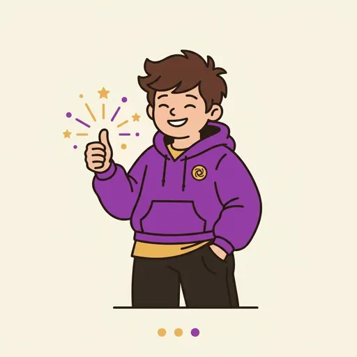
Every Spark & Anvil app shares a deliberately-chosen visual register — chunky-cartoon flat-vector, bold dark outlines, flat saturated fills. Familiar across the portfolio so kids feel at home anywhere they land.
Brand palette
#E8652B Primary CTAs, key UI
#2D2D2D Text, icons, grounding
#FFBE2E Highlights, accents
#FAF8F5 Backgrounds
#4A6FA5 Links, secondary
The chunky-cartoon register
- Bold uniform outline —
#2A1F1Aat consistent weight on every shape boundary. Reads as intentional ink, not anti-aliased lines. - Flat saturated fills — no gradients, no noise, no 3D shading. Every region is one color.
- Toca-Boca / Animal-Crossing reference — chunky proportions, warm rounded forms, kid-readable at a glance.
- No sparkle, no glow — visual effects undermine the "made by careful humans" trust signal we want with parents.
- Per-app hero color — each app picks a single accent from the palette below. Coherence across the portfolio + personality per app.
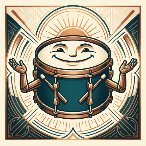
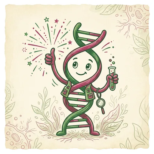
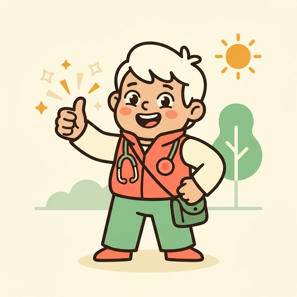
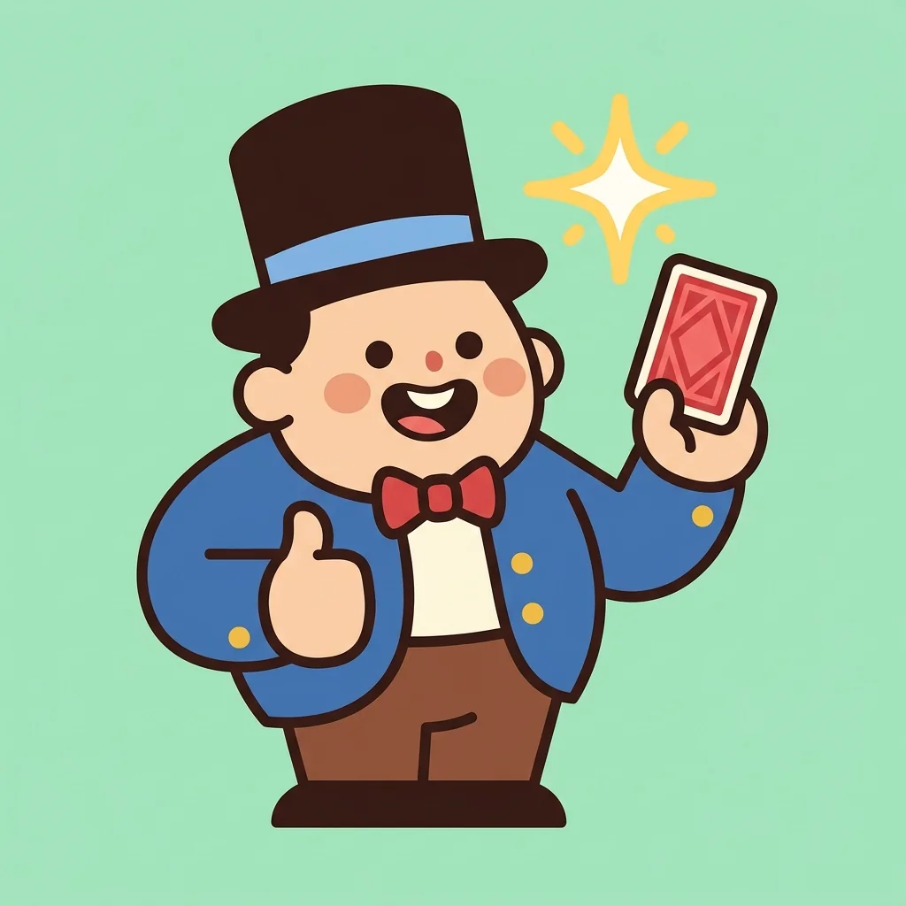
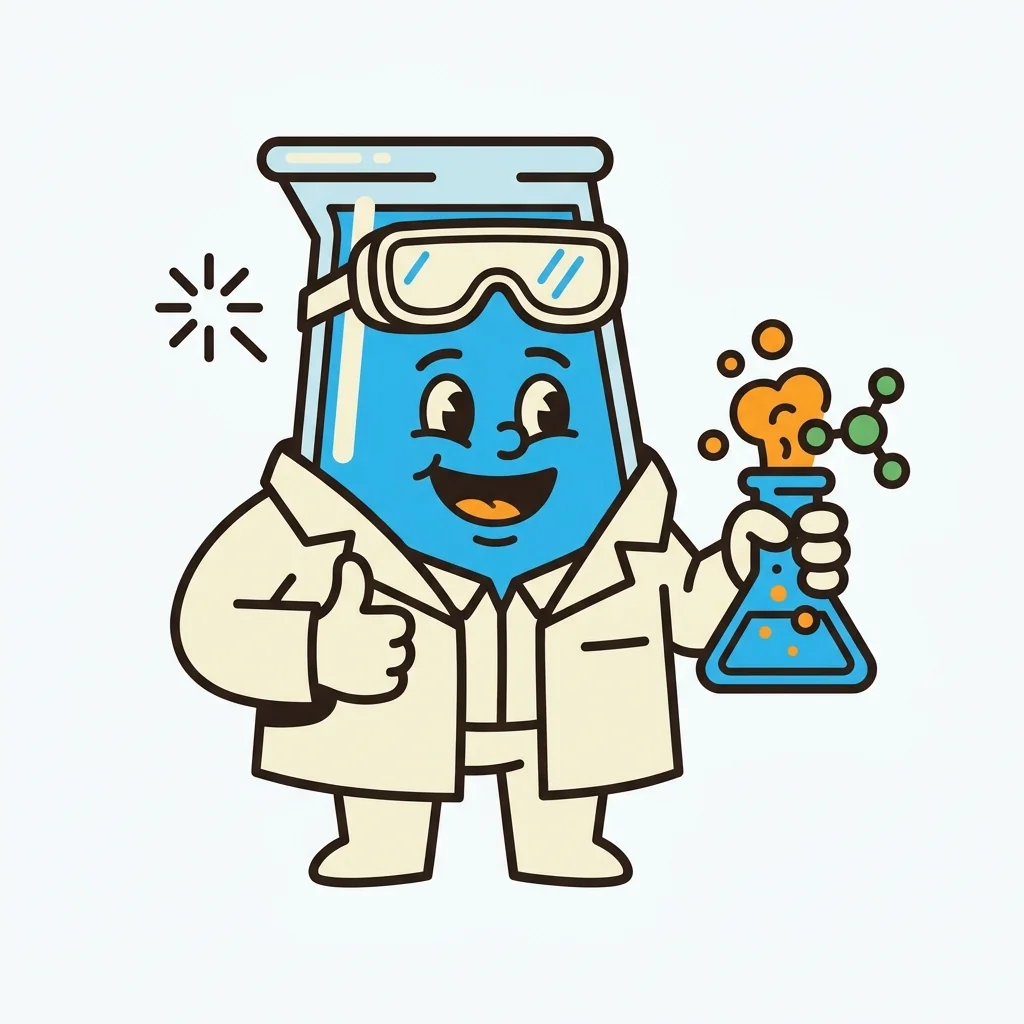
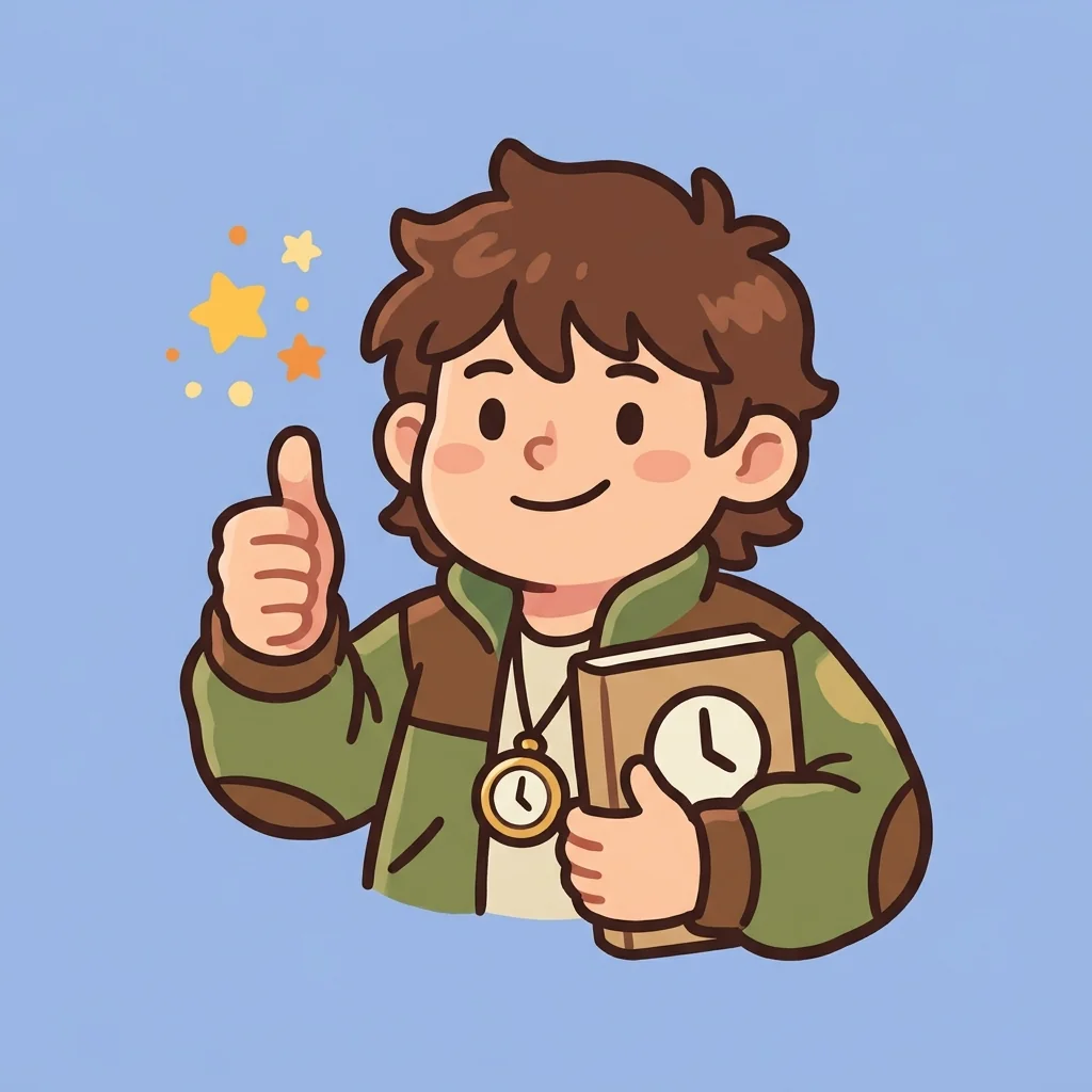
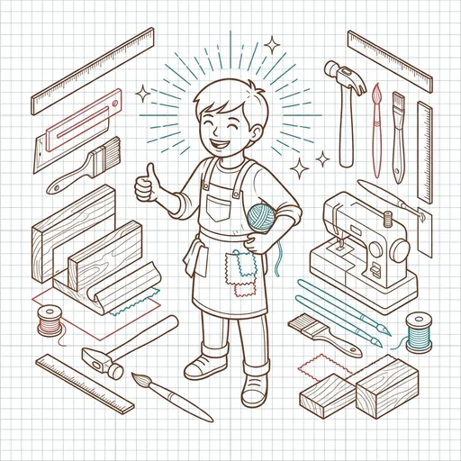
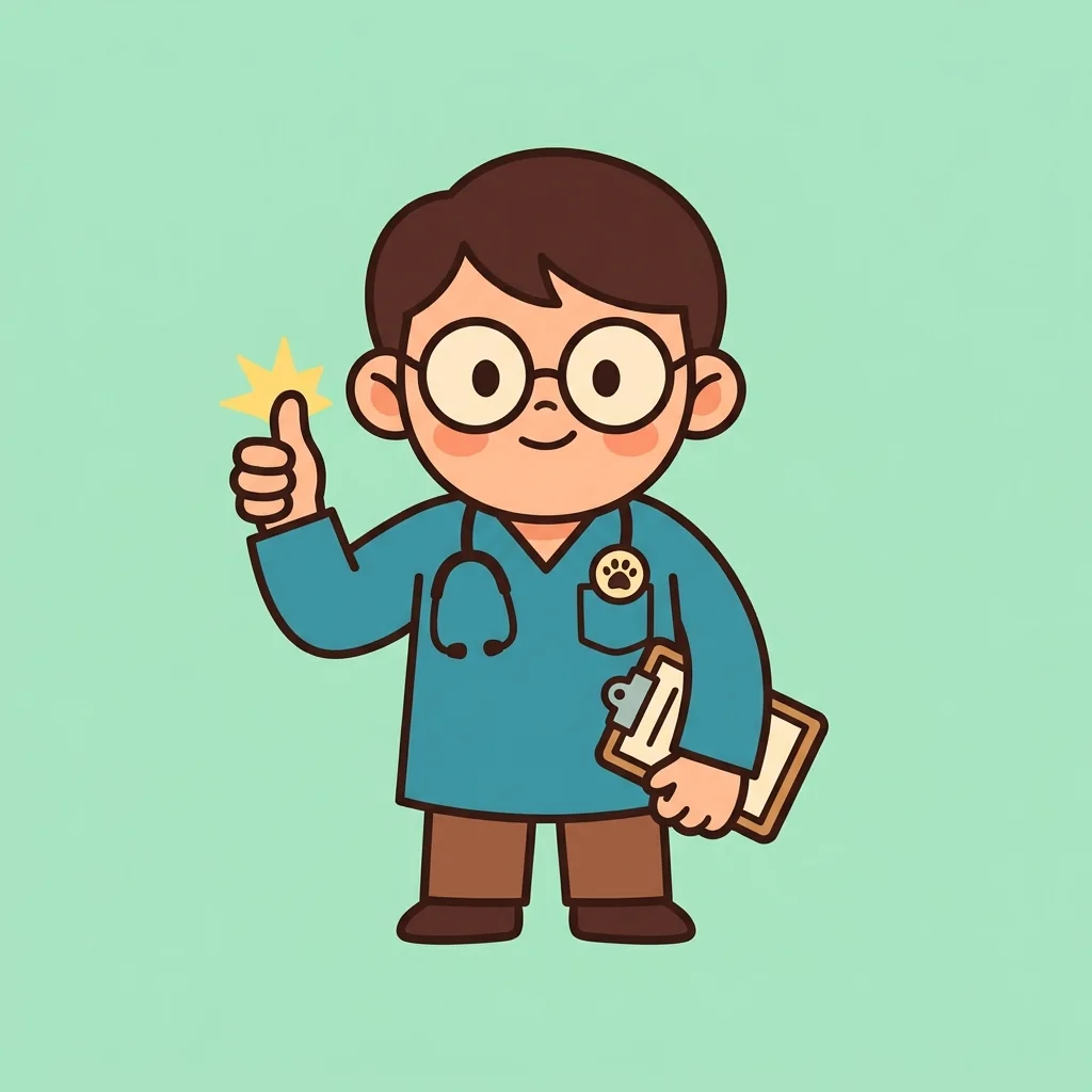
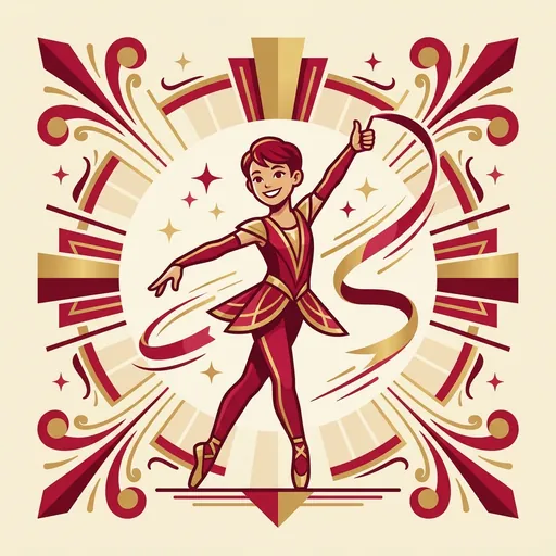
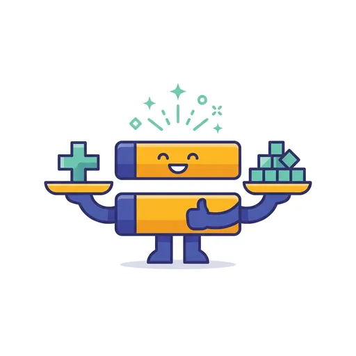
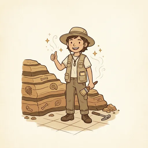
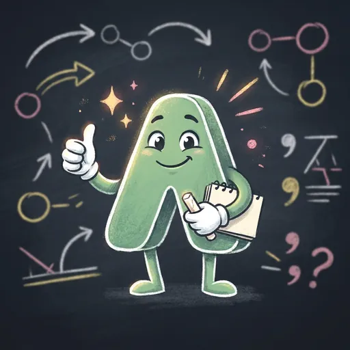
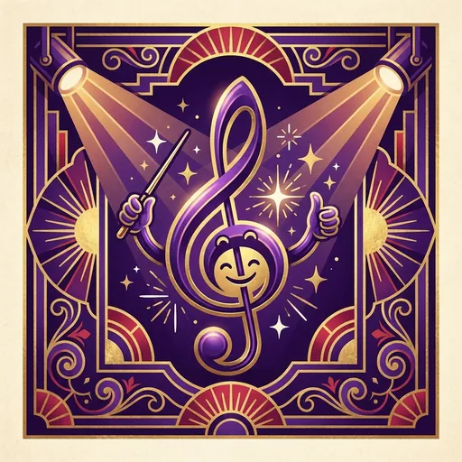
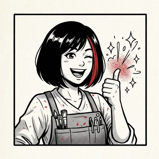
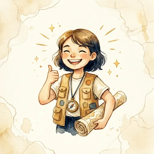
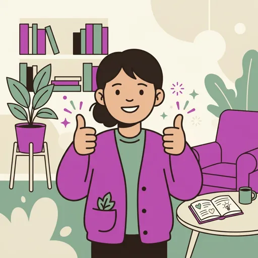
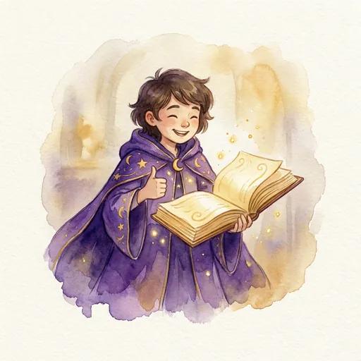
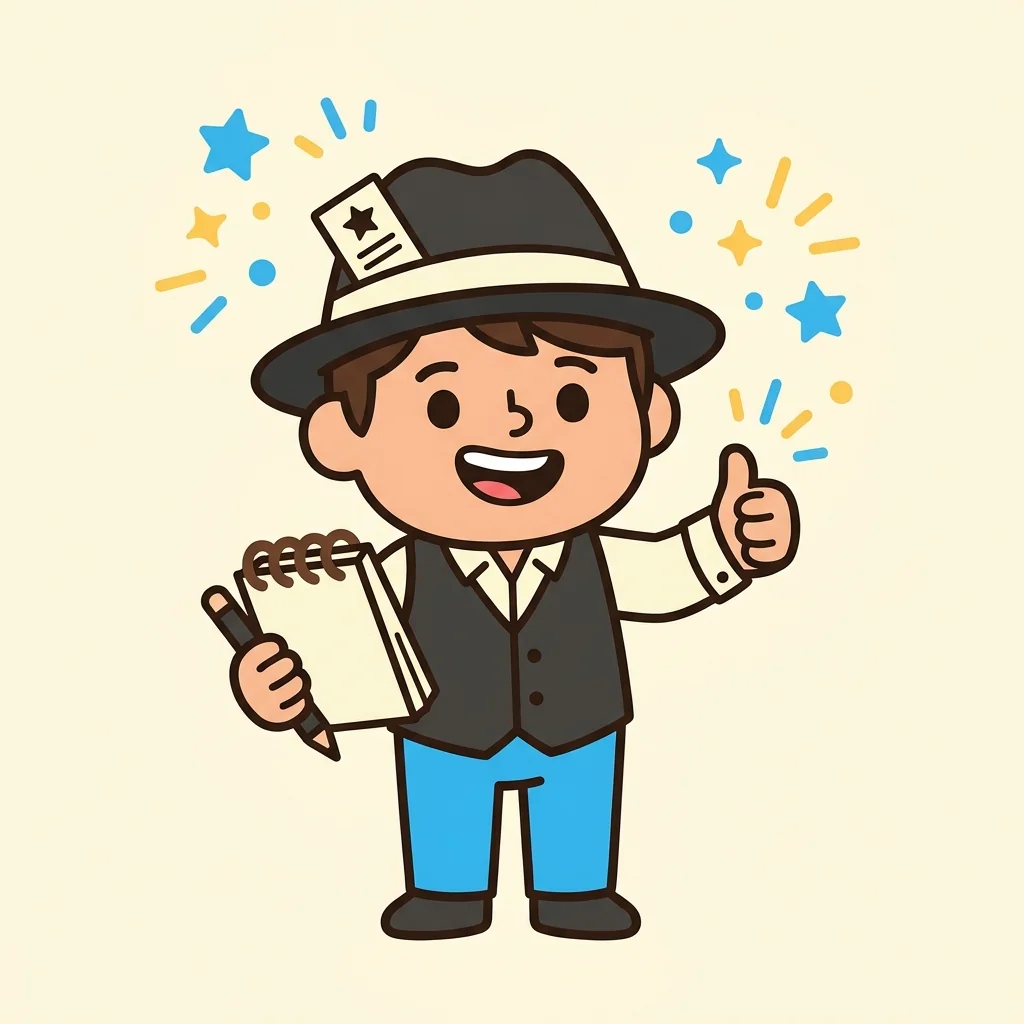
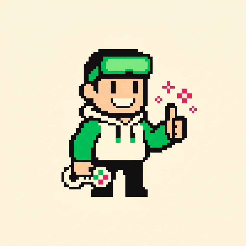
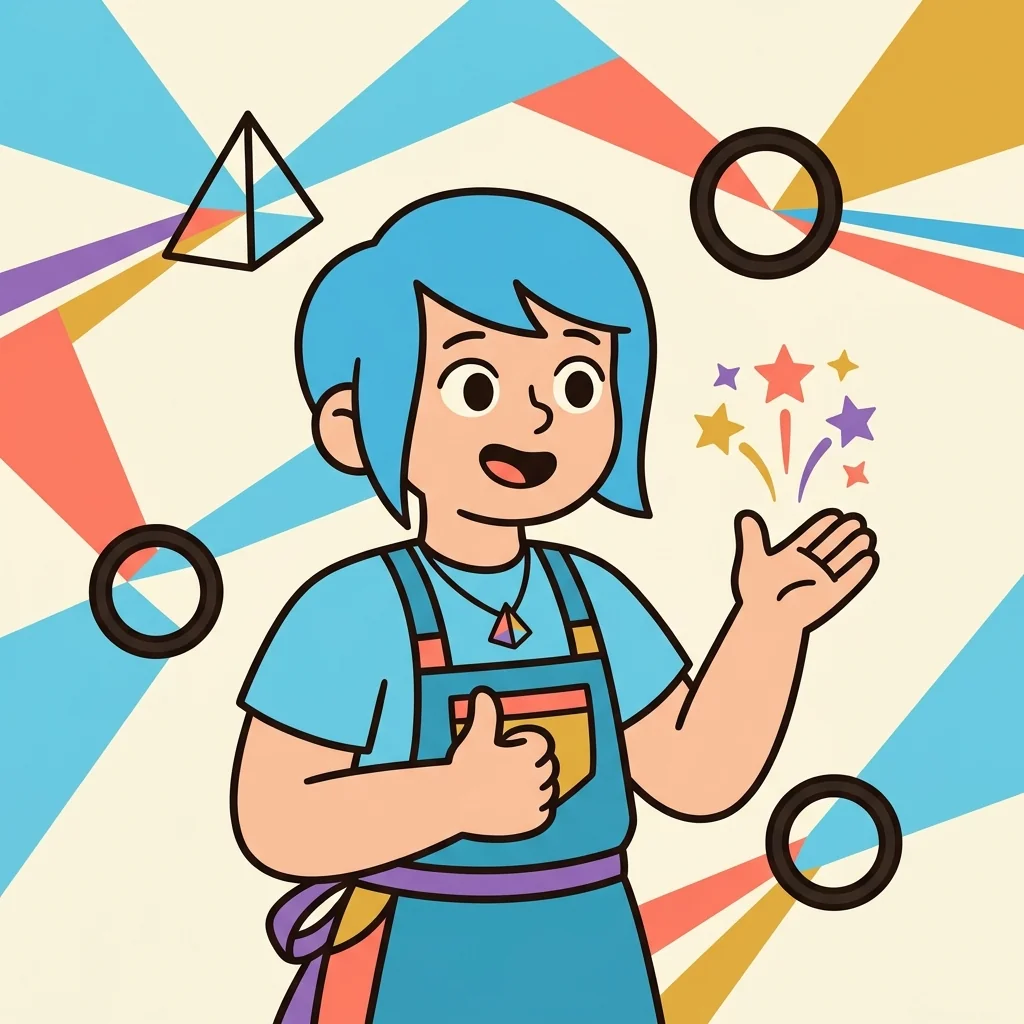
The mascot lineup
24 of 96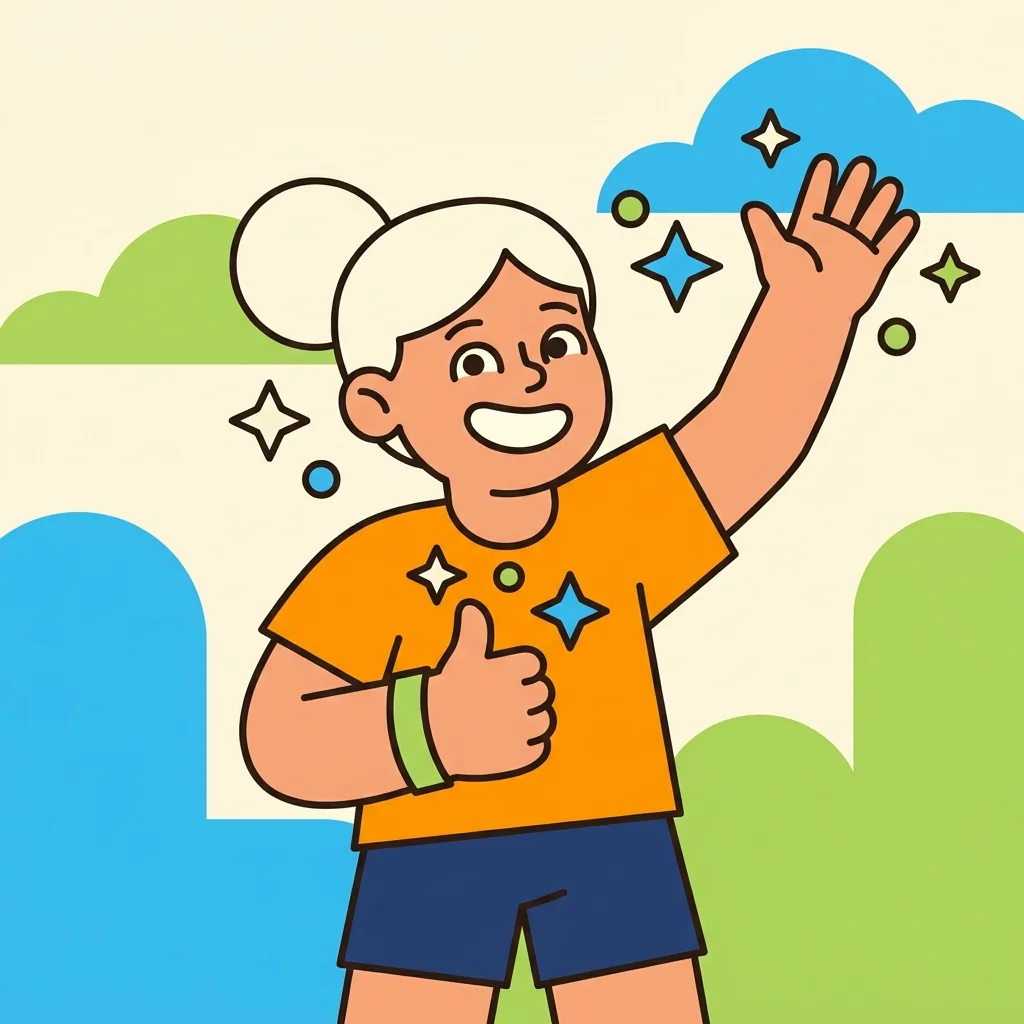

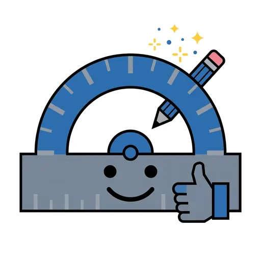
Icon system
24 of 109Every app icon is rendered through the same chunky-cartoon style template. The icon clearly signals the app's subject area while remaining visually consistent across the portfolio — so a parent who liked one Spark & Anvil app can recognize another instantly.
Powered by ForgeKit
ForgeKit is the open-source Swift Package Manager framework underneath every Spark & Anvil app. 50+ modules covering accessibility, COPPA, on-device AI integration, persistence, celebration, gamification, and the avatar system.
The visual coherence above is partly a result of design choices and partly enforced by ForgeKit primitives — same color palette tokens, same component library, same celebration vocabulary across every app the user touches.
Press & brand assets
Logos, brand colors, mascot art, and the design system reference. Downloadable bundle for press, partners, and reviewers.
Press kit →